April 17, 2025
Why I Wore a Pink Shower Cap (And What It Taught Me About Branding)
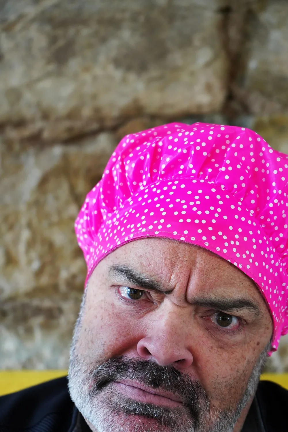
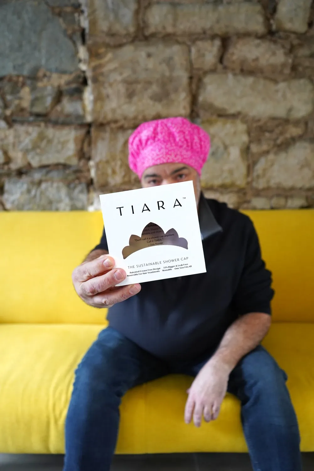
I bet you’re wondering why a guy with no hair is wearing a bright pink shower cap, eh?
I take my work seriously. (Even if it doesn’t look like it here 😉). Whether it’s a food or beverage brand, a technology application or a shower cap - I need to do a deep dive and understand the story, the audience and where the brand is going.
I sample every product, whether I need it or not before we dive into branding or creative work. So what if I don’t have hair? I needed to know more about Tiara, a woman-owned brand that started out as a line of colourful, durable and sustainable shower caps. So here we are…
TIARA came to me as a referral from another client. Their founder Zuly Otalora-Matallana, had established a brand with a strong focus on sustainability and environmental responsibility. The product was already on the shelves in retailers like Winners, but the sales weren’t there. The issue? Packaging.
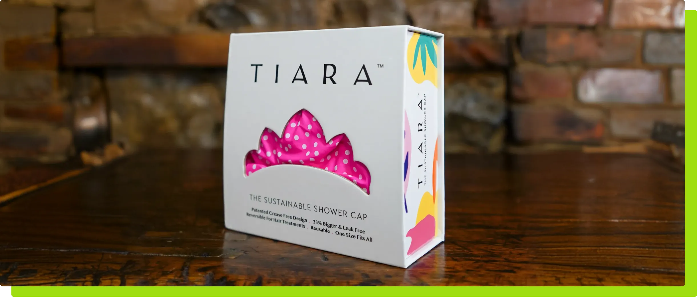
The packaging at the time was… unremarkable. It featured a photo on the front of the box and the packaging material was basic. Nothing necessarily wrong with it - however, with many cap colour options to choose from, it didn’t showcase which colour was within the box, and it made the very durable product seem like a cheap retail option, with a higher than average price point comparatively.
There was no need to start from scratch with an established brand and an excellent product. It simply needed a re-THINK (see what I did there?)
Key Design Changes included:
- Premium Box: We replaced the original box with a thick chipboard square box featuring a magnetic closure, elevating it to the level of jewelry or fragrance packaging as it pertains to retail merchandising. This not only enhanced the perceived value but also made the box reusable for storage.
- Minimalist Exterior, Vibrant Interior: The outer packaging was kept clean and white, allowing the bright fuchsia of the product to pop. Once opened, the inside revealed a playful pattern of vibrant colors—bringing an experiential feeling of joy and luxury in line with the brand’s personality.
- Windowed Design: We replaced the image on the front of the box with a tiara-shaped window, allowing customers to immediately see the color, pattern, and texture of the shower cap without opening the box or needing different packaging for each variation.
- Brand Storytelling: Every aspect of the new packaging was designed to communicate Tiara’s sustainability and reusability, reinforcing its value proposition to eco-conscious consumers.
The result? The new packaging was aligned with the price point of the product and elevated its placement on retailers shelves - think: jewellery + fragrance sections. It made an immediate impact on sales now that it stood out on the shelves.
Zuly went on to appear on Dragon's Den and eventually expanded her line into natural deodorants (and if I know her, there is still more to come!)
All in all, this was a project that presented a packaging challenge that we were able to tackle with a mix of strategy, consumer psychology and creativity.
And, my head stayed dry during the initial test run, in case you were curious.